One Sheet, Infinite Play
Begin with Physical Reality
Paper sizes, margins, and safe zones
A4 and Letter differ in subtle but crucial ways that can deform alignment when components sit too close to edges. Define generous safe zones, accommodate non printable margins, and include a flexible trim strategy. If a line shifts, the game should still assemble cleanly. Offer print guidance for both sizes, and consider alternate layouts to avoid users scaling the file, which quietly ruins proportions and icon clarity.
Ink usage, contrast, and home printer quirks
Most players print in draft or grayscale, and many rely on aging inkjets that crush subtle gradients. Favor high contrast palettes, avoid fine hairlines, and test with desaturated proofs. Provide a low ink version with strong value separation and pattern fills. Use texture rather than heavy color blocks, and verify symbols remain legible when slightly fuzzy. Reward thrift without sacrificing function, so the page looks good under harsh kitchen lighting.
Build a Grid that Teaches

Typeface choices for tiny components
Pick families with strong x height, distinct letterforms, and sturdy strokes that resist ink bleed. Avoid fragile hairlines and overly condensed weights that choke under compression. Consider a pair that balances approachable rules text with assertive numerals on cards. Print at 8, 9, and 10 point to verify comfort. If you squint, players will struggle. Clarify quotation marks, apostrophes, and punctuation that often vanish in draft mode.
Numbers, symbols, and dice results at a glance
Treat digits as icons. Ensure 1 and 7 cannot be confused, and 6 and 9 remain distinct even when rotated. Test symbols without color reliance, using shape and contrast as primary carriers. Give scores and costs priority on components, with padding that protects against uneven cuts. Align consistently so players can scan across a fan of cards instantly. Quick comprehension lowers cognitive load and accelerates decision making at the table.
Accessibility without inflating the page
Accessibility begins earlier than font size. Favor plain language, short sentence structures, and active verbs. Increase contrast and avoid relying solely on color to encode states. Provide an alternate high contrast file, and consider a bold friendly typeface for captions. Use icons paired with words until conventions stick. Maintain predictable placement so muscle memory forms. These adjustments help everyone while keeping the single page constraint intact and respectful.


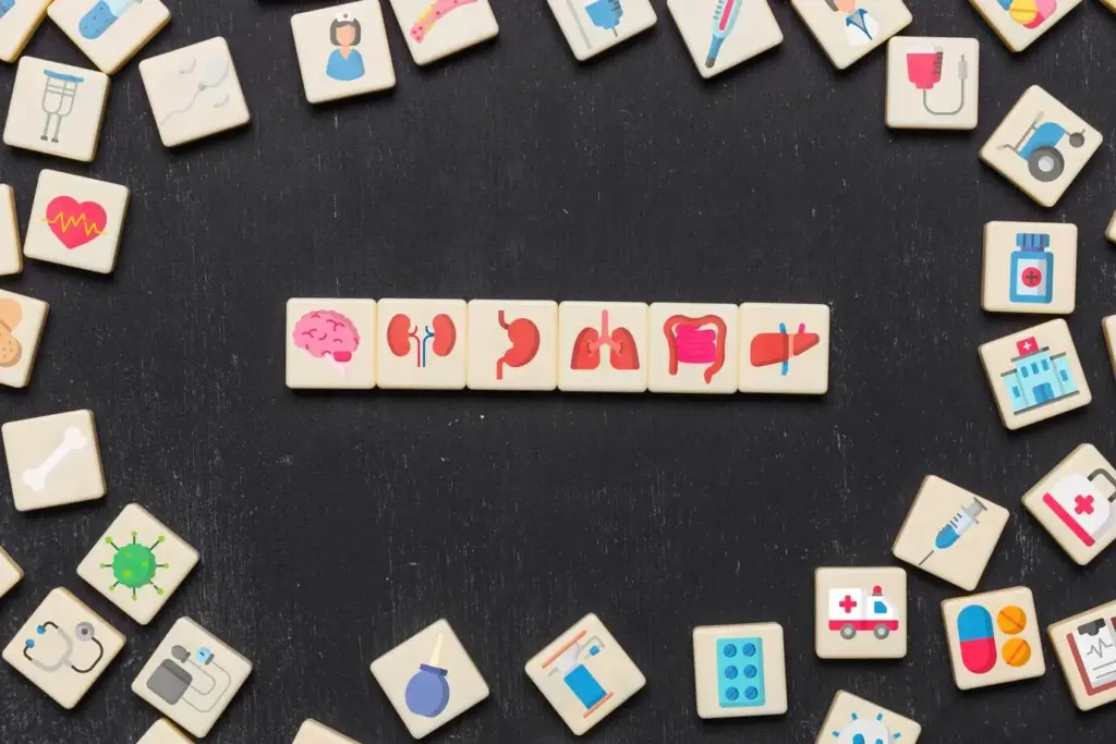
Iconography and Color that Travel Well
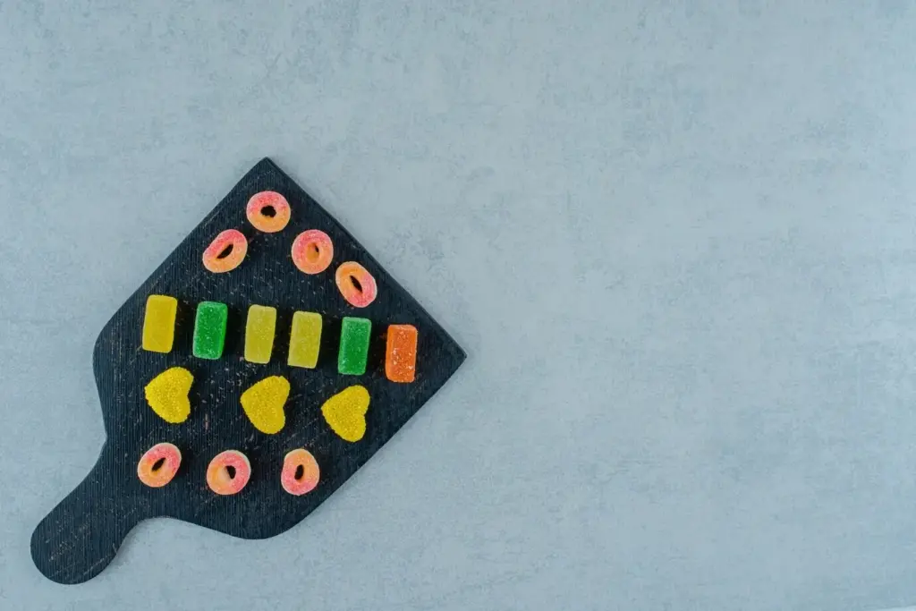
Components from a Single Page
From vectors to rock solid PDFs
Registration marks and assembly aids
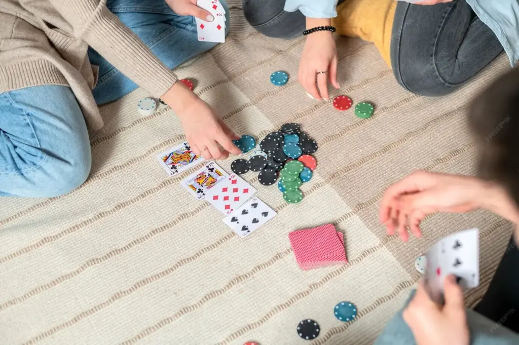
First Play Delight
A quick start corner that removes friction
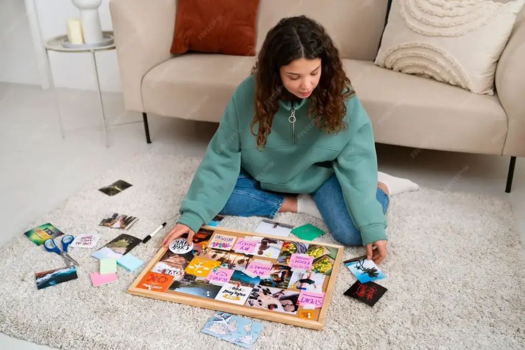
Reserve a visual corner that teaches by doing. Include three steps, one example, and a clear win condition for the first micro scenario. Avoid jargon and defer edge cases. If someone can start playing while others finish cutting, you found magic. The quick start corner becomes a lighthouse, signaling that fun is immediate and that the layout respects the player’s time as much as their curiosity and creative energy.
Tutorial turns printed into the layout
Bake a scripted first turn into component backs or margins so players experience movement, costs, and resolution before confronting the full rules. Use arrows, numbers, and short prompts that map to the actual board or cards. When muscle memory forms early, the rest of the rulebook feels smaller. This approach transforms learning into discovery and removes the anxiety of wrong first steps that can stall a whole evening.
Reducing mental load while raising excitement
Pair every new concept with a reassuring cue. Limit simultaneous choices during the first minutes, lean on icons previously taught, and postpone rare exceptions. Celebrate small successes through bold feedback in layout and component design. Anticipate predictable questions with nearby answers. Momentum multiplies enthusiasm, and enthusiasm invites sharing. When players finish a first game smiling, they forgive scuffs and immediately plan a second, which is the real victory.
Stories from the Kitchen Table
The misaligned token that taught alignment
A friend cut quickly, then sighed when circles looked like eggs. We realized the trim marks were too subtle and the token art bled into the guide. We thickened the lines, added a dashed buffer, and mirrored color behind the edge. Next session, perfect circles appeared. The change took minutes and prevented dozens of reprints, reminding us that alignment is not a warning text; it is a visible, designed promise.
The gray cartridge that forced better contrast
An almost empty cartridge produced an accidental stress test. Gradients vanished, fine outlines broke, and icons fused with backgrounds. We swapped decorative shading for texture, pushed value contrast, and replaced thin strokes with confident shapes. The resulting page looked cleaner even on premium printers. Constraints pruned vanity and revealed function. Now we intentionally test at low ink before releases, because real players meet games in real, imperfect conditions weekly.
The five minute rule that changed onboarding
We set a timer and promised to reach the first decision in five minutes from print. The page failed the first attempt by ninety seconds. After moving quick start steps to the top left, numbering the cut path, and bolding the first choice, we hit four minutes and twenty seconds. That tiny victory transformed perception. Players felt respected, relaxed, and eager to replay. Deadlines, when humane, become design allies rather than tyrants.